


FAQ Template If you’ve ever landed on a website with a burning question—“How much is shipping?”, “Can I cancel later?”, “Is this safe?”—you probably went hunting for one thing: the FAQ page.
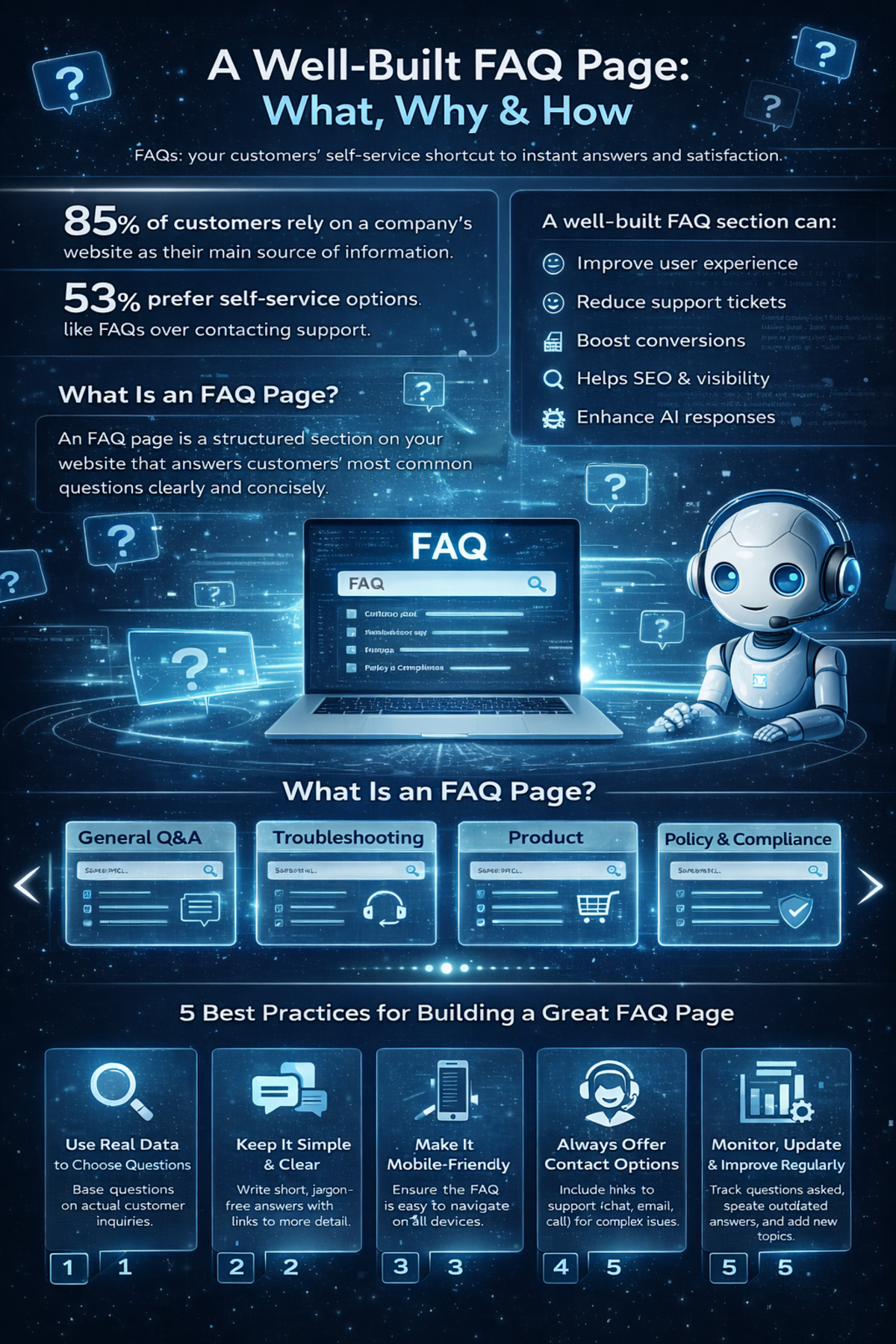
You’re not alone. Research shows that around 85% of customers rely on a company website as their main source of information, and more than half of them (53%) actually prefer self-service options like FAQ pages over contacting support. In an AI-driven, always-on world, people expect answers instantly, without waiting in a queue or writing long emails.
That’s where a well-built FAQ page becomes a quiet powerhouse.
A clear, structured FAQ Template section doesn’t just help users help themselves. It can also:
-
Improve your user experience
-
Reduce support tickets
-
Boost conversions
-
Help you rank better in search engines, especially in “People Also Ask” boxes
-
Even show up inside AI-generated responses from large language models
In this guide, we’ll walk through what an FAQ template is, the different formats you can use, where to place it, 18 real-world FAQ examples to inspire you, and best practices to build an FAQ page that both customers and search engines love.
What Is an FAQ Template and Why It Matters
An FAQ template is a structured layout you use to display frequently asked questions and their answers on your website or product experience.
In simple terms, it’s the building block of your FAQ page.
The goal? Make it insanely easy for people to:
-
Find the questions they’re most likely to ask
-
Get clear, fast answers without talking to support
-
Understand your products, services, and policies
Most FAQ Template layouts group questions into logical categories such as:
-
Account management
-
Payments and billing
-
Shipping and delivery
-
Returns and refunds
-
Technical issues and troubleshooting
This structure does two things:
-
It helps users find what they need without friction.
-
It shows your brand is organized and customer-focused.
In other words, a good FAQ template is like a well-signposted highway—no one wants to get lost trying to solve a simple problem.
Types of FAQ Templates You Can Use
There’s no “one-size-fits-all” design. Different businesses and use cases call for different FAQ formats. Here are some popular types you can use or combine.
1. General Q&A Layout
This is the classic FAQ style: a list of questions and answers, often grouped in sections.
-
Best for: Small websites, simple services, early-stage businesses.
-
Why it works: Easy to scan, easy to maintain, and easy to understand.
2. Product-Specific FAQ
Here, each product or service gets its own FAQ section or page.
-
Best for: E-commerce, SaaS, subscriptions, complex offerings.
-
Why it works: Customers get answers tailored to what they’re actually buying or using.
3. Troubleshooting Guide FAQ
This format focuses on resolving issues and errors.
-
Best for: Software, apps, hardware, tools, platforms.
-
Why it works: Reduces support load by answering “why isn’t this working?” questions.
4. Customer Service FAQ
This one covers questions about support itself:
-
“How do I contact support?”
-
“What are your response times?”
-
“Do you offer live chat?”
-
Best for: Service-heavy businesses, B2B, SaaS, marketplaces.
-
Why it works: Sets clear expectations and reduces frustration.
5. Policy and Compliance FAQ
This layout centers on:
-
Refund and return policies
-
Privacy and data use
-
Terms and conditions
-
Legal and compliance details
-
Best for: Regulated industries, global brands, financial, health, legal products.
-
Why it works: Builds trust and transparency while answering serious concerns.
6. Pre-Purchase Inquiry FAQ
Think of this as FAQ designed to remove friction before a sale:
-
“Do you ship internationally?”
-
“Is there a free trial?”
-
“Can I cancel anytime?”
-
Best for: E-commerce, SaaS, subscriptions, premium services.
-
Why it works: Tackles doubts at the decision stage and boosts conversion.
7. Single FAQ Page
Everything lives on one main FAQ hub, often with search and categories.
-
Best for: Brands that want one central knowledge hub.
-
Why it works: Users learn “if it’s a question, it’s probably answered here.”
8. Homepage FAQ
Short FAQ blocks right on the homepage.
-
Best for: Startups, landing pages, product launches.
-
Why it works: Handles core objections without forcing users to dig around.
9. Blog Post FAQ
You embed FAQs directly inside articles or at the end of posts.
-
Best for: SEO-focused blogs, content-heavy sites.
-
Why it works: Answers related questions, catches long-tail keywords, and improves search visibility.
10. Video FAQ
Questions are answered via short videos, sometimes paired with text.
-
Best for: Visual brands, complex tools, apps, education.
-
Why it works: Builds connection and simplifies topics that are easier to show than tell.
11. AI-Powered FAQ
Users type natural-language questions into a chatbot or search box that pulls answers from your knowledge base.
-
Best for: Large knowledge bases, SaaS, customer portals, enterprise.
-
Why it works: Feels like a conversation, delivers more personalized, dynamic answers.
Why an FAQ Template Improves Customer Experience
You might be wondering: “If I have a support team, do I really need a detailed FAQ?”
Yes. Here’s why.
24/7 Accessibility
Customers don’t always operate on your schedule. An FAQ page:
-
Works around the clock.
-
Serves users in different time zones.
-
Helps night owls and early birds alike.
It’s self-service support that never sleeps.
Accuracy and Consistency
Your FAQ should act as a single source of truth.
Instead of different team members giving slightly different answers, your FAQ:
-
Standardizes responses
-
Reduces confusion
-
Keeps messaging consistent across support, sales, and marketing
Higher Customer Satisfaction
Most people don’t want to contact support for basic questions.
A well-thought-out FAQ:
-
Gives instant answers
-
Reduces frustration
-
Makes customers feel in control
The faster someone can solve their problem, the better they feel about your brand.
What Makes a High-Quality FAQ Template Page
You can’t just toss a few questions on a page and call it a day. A strong FAQ Template has specific elements that make it effective.
Here’s what you should include:
Clear and Concise Questions
Use the exact language your customers use.
-
Avoid jargon and internal terms.
-
Turn questions into simple, natural phrases.
-
Example: Instead of “What are your fulfillment policies?”, use “How long does shipping take?”
Straightforward, Helpful Answers
Answers should:
-
Be concise but complete
-
Use plain language
-
Get to the point in the first sentence
-
Provide extra detail after you’ve answered the question
If more explanation is needed, link to a dedicated blog post, help article, or guide.
Logical Categories and Sections
Group questions into relevant categories, such as:
-
Getting started
-
Billing and payments
-
Shipping and delivery
-
Returns and cancellations
-
Technical issues
This turns chaos into order and helps users self-navigate.
Search Functionality
On larger FAQ pages, a search bar is essential.
-
It lets users type their question directly.
-
It speeds up discovery.
-
It’s especially helpful for complex products.
Links to Additional Resources
Don’t force long explanations into a single FAQ answer. Instead:
-
Link to guides, manuals, videos, and blog posts.
-
Offer “Read more” options for those who want depth.
-
Use FAQs as entry points to your wider knowledge base.
Clear Contact Options
Even the best FAQ won’t cover every edge case.
Make sure you include:
-
Email or contact form links
-
Live chat (if available)
-
Phone number (if relevant)
-
Links to community forums or help centers
The message should be: “If the FAQ didn’t solve it, here’s the next step.”
Where to Place Your FAQ Template for Maximum Impact
Placement is just as important as content. If users can’t find your FAQ, it’s useless.
Here are smart places to put or link to your FAQ page:
Main Website Navigation
Add “FAQ” or “Help” to your primary menu or footer.
-
Makes it discoverable from any page.
-
Sets user expectations: “Help is always one click away.”
Product or Service Pages
You can embed mini FAQ blocks directly into product or service pages. For example:
-
Answer questions about sizing, shipping, compatibility, usage, guarantees.
-
Place them near pricing sections, CTA buttons, or below product details.
This is where people hesitate—your FAQ helps remove those doubts in context.
Checkout Process
Checkout is prime time for anxiety:
-
“Will I be charged extra?”
-
“How long will delivery take?”
-
“Can I apply this promo code?”
Include:
-
A link to FAQ near the total price or payment section.
-
Or a small expandable FAQ module on the checkout page.
This can directly reduce cart abandonment.
Customer Account Portal
If you have a login area, dashboard, or portal, add an in-context FAQ section:
-
Account settings
-
Billing
-
Order tracking
-
Subscription management
You’re showing: “You don’t have to leave this page to find help.”
Social Media and Email Signatures
Use your FAQ page as a go-to support resource:
-
Add the FAQ link in your email signature.
-
Share specific FAQ answers on social media.
-
Use FAQ links in automated replies or DMs.
This cuts down back-and-forth and gets customers answers faster.
18 FAQ Template Examples to Inspire You
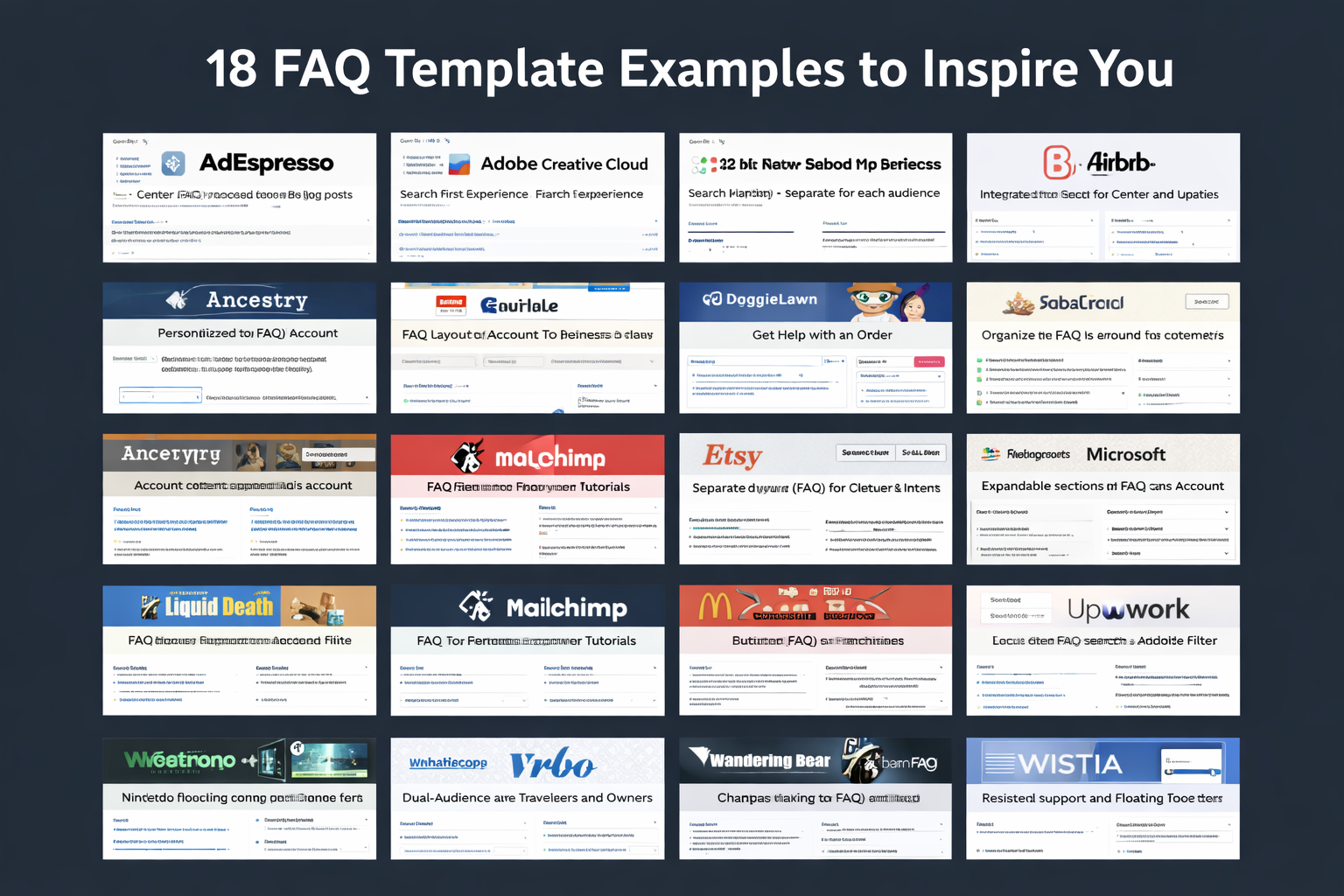
Let’s look at how real brands design their FAQ experiences. Each of these examples highlights a useful idea you can borrow.
1. AdEspresso – Simple, Focused, and Resource-Rich
AdEspresso—a tool for Facebook and Instagram ads—keeps its FAQ clean and distraction-free.
Key strengths:
-
Centered layout with a short list of well-chosen questions.
-
Each question links to a longer blog post or resource for deeper learning.
-
Clear paths to further help if users don’t find what they need.
The design is all about clarity and confidence—no clutter, no overwhelm.
2. Adobe Creative Cloud – Search-First Experience
Adobe Creative Cloud uses a very intuitive FAQ setup.
Notable features:
-
Prominent search bar at the top of the page.
-
Sidebar navigation with well-organized categories like account, billing, and apps.
-
Virtual assistant/chat for users with more complex questions.
The result: users can either search, browse, or get guided help—whatever suits them best.
3. Airbnb – Role-Based FAQ for Hosts and Guests
Airbnb uses a knowledge-base style FAQ designed around two core audiences:
-
Hosts
-
Guests
What works well:
-
Two clear branches of content based on user type.
-
Each branch contains FAQs plus links to in-depth support articles.
-
Use of visuals and videos to explain complex topics like policies and management.
-
Community forums integrated for peer-to-peer support.
This is a great example of tailoring FAQs to different user roles.
4. Airtable – Integrated Help Center Approach
Airtable blends FAQs into a full help center.
Highlights:
-
FAQ-style questions organized into clear topics.
-
Searchable support portal that pulls answers from articles, guides, and tutorials.
-
Answers that often go beyond basics with detailed, step-by-step help.
It’s a strong model for SaaS platforms with growing features and user needs.
5. Ancestry – Personalized FAQ Experience
Ancestry takes a more personalized route.
Unique twist:
-
Logged-in users see FAQ content that adapts to their account and results.
-
Links to account settings and specific features related to genealogy.
For a product as personal as family history, this tailored approach makes perfect sense.
6. DoggieLawn – FAQ Plus Live Chat Backup
DoggieLawn keeps its FAQ layout simple but adds a useful twist: live chat.
Standout features:
-
Clear, accordion-style dropdown questions.
-
Concise but helpful answers.
-
Live chat option available during business hours on the same page.
If customers can’t find what they need, help is one click away—without leaving the FAQ.
7. Etsy – Separate FAQs for Buyers and Sellers
Etsy splits its content based on user type:
-
Buyers
-
Sellers
Key design choices:
-
Search bar at the top for quick queries.
-
“Get Help with an Order” button for fast issue resolution.
-
Separate FAQ flows so users don’t have to sift through irrelevant stuff.
This is ideal for marketplaces with multiple audiences.
8. Fabletics – Category-Based FAQ for Common Issues
Fabletics organizes its FAQ around customer intent.
What they do:
-
Categories like orders, returns, exchanges, and membership.
-
Each category lists top questions in a simple, readable format.
-
Related question lists so users can explore without multiple clicks.
It reduces friction by keeping answers one or two clicks away.
9. Liquid Death – On-Brand, Funny, and Still Helpful
Liquid Death is a brand that sells canned water with a wild personality—and its FAQ matches the tone.
Why it works:
-
Humorous copy that fits the brand while still providing real answers.
-
Accordion dropdowns for an organized layout.
-
Clear visual hierarchy with bold headings.
They prove your FAQ can be both useful and entertaining without losing clarity.
10. Mailchimp – FAQ That Empowers Users
Mailchimp structures its FAQ around making users feel capable.
Key elements:
-
Topics like billing, setup, and email marketing separated cleanly.
-
Tutorials and how-to guides linked within answers.
-
Multiple support options at the bottom of sections (chat, email, etc.).
It’s a teaching tool as much as it is a Q&A section.
11. McDonald’s – Filterable FAQ for Large Content Sets
McDonald’s has a massive FAQ but keeps it manageable.
Smart features:
-
Filters for topics like nutrition, locations, franchising.
-
Users can narrow answers to only the category they care about.
-
Reduces scrolling and speeds up discovery.
If you have a large library of questions, this filtering approach is worth copying.
12. Microsoft – Expandable Sections for Depth Without Clutter
Microsoft uses expandable sections to keep their FAQ tidy.
What stands out:
-
Clear categorization across account, pricing, features, and more.
-
Accordion panels that expand for detailed answers without crowding the page.
-
Easy links to contact support when needed.
Users get both a clean layout and depth where necessary.
13. Nintendo – Product-Based FAQ with Jump Links
Nintendo uses a traditional Q&A style but organizes it smartly.
Highlights:
-
Questions grouped by topic (hardware, games, account).
-
Jump-to links that take users directly to specific sections.
-
Product and game-level categories for extra relevance.
Ideal for brands with multiple product lines and user scenarios.
14. Upwork – Powerful Search and Audience Filters
Upwork focuses on search and segmentation.
Notable features:
-
Prominent search bar suggesting common queries.
-
Topic filters for freelancers, clients, and account management.
-
Related topic suggestions to avoid repeated searches.
-
Options to contact support or join the community when answers aren’t enough.
A great example of FAQ plus support ecosystem.
15. Vrbo – Dual-Audience FAQ for Travelers and Owners
Vrbo serves two main user types:
-
Travelers
-
Property owners
They:
-
Split the FAQ into sections for each audience.
-
Use categories like booking, payments, and property management.
-
Use accordions for cleaner reading.
-
Add visuals and even a rating feature so users can mark answers as helpful or not.
This feedback loop is handy for improving FAQs over time.
16. Wandering Bear – Fun, On-Brand, and Informative
Wandering Bear is a coffee brand with a playful personality—and it shows in their FAQ.
What makes it work:
-
Fun, quirky tone that makes reading FAQs less boring.
-
Clear, structured answers despite the humor.
-
Links to product guides and other resources.
It’s proof that even mundane topics like shipping can feel on-brand and engaging.
17. WhatsApp – Compact, Organized, and Popular Topics
WhatsApp uses a clean FAQ layout with:
-
Drop-down table of contents to jump between topics.
-
Popular topics highlighted on the side.
-
Search bar for specific questions.
The structure is minimal but efficient—ideal for an app used by billions.
18. Wistia – FAQ with Persistent Support Access
Wistia has a video-focused platform, and its FAQ reflects clarity and accessibility.
Great features:
-
Floating footer with a search bar and support ticket button.
-
Categories like video management, analytics, and integrations.
-
Well-placed calls to action for next steps.
Users always have a visible route to more help.
How to Create an FAQ Page: 5 Best Practice
Ready to create (or improve) your FAQ page? Don’t just dump answers onto a page. Use these best practices.
1. Use Real Data to Choose Questions
Don’t guess what you think people ask—look at:
-
Google Analytics and Google Search Console (search queries, site search terms)
-
Support tickets and chat transcripts
-
Sales call notes
-
Social media DMs and comments
If you see the same questions over and over, they deserve a place on your FAQ page.
2. Keep It Simple and Clear
Avoid:
-
Long paragraphs of fluff
-
Overly technical language
-
Vague answers
Do:
-
Answer the question in the first line.
-
Use short sentences and simple words.
-
Link to additional resources for more detail.
Simplicity builds trust.
3. Make It Mobile-Friendly
A large portion of your visitors will view your FAQ on mobile.
So:
-
Use responsive design.
-
Make accordions and dropdowns thumb-friendly.
-
Keep font sizes readable on smaller screens.
-
Avoid large blocks of text.
Test your FAQ on a phone, not just on a desktop monitor.
4. Always Offer Contact Options
Even if your FAQ is excellent, some people will still:
-
Have unique situations
-
Prefer human interaction
-
Need reassurance
Make sure there’s always a visible way to:
-
Email support
-
Open live chat
-
Submit a ticket
-
Call (if your business supports that)
Think of your FAQ as the first line of defense, not the only one.
5. Monitor, Update, and Improve Regularly
An FAQ page is not “set it and forget it.”
You should:
-
Track which questions get viewed most often.
-
Identify searches that return no results (these may highlight missing topics).
-
Update answers when products, policies, or processes change.
-
Add new questions based on customer feedback and new features.
Your FAQ should evolve alongside your business.
Common FAQ Page Mistakes to Avoid
As useful as FAQs are, many brands get them wrong. Here are the pitfalls you should dodge.
Overloading Users with Information
If every answer looks like an essay, people will give up.
Instead:
-
Keep answers short and structured.
-
Use bullet points where appropriate.
-
Link out to deeper resources if needed.
The FAQ is not your full manual—it’s the quick reference guide.
Poor Organization and No Categories
A long list of ungrouped questions is overwhelming.
Fix it by:
-
Grouping related questions into sections.
-
Using clear headings and subheadings.
-
Adding filters or navigation for large FAQs.
Think like a librarian, not just a writer.
Letting FAQs Go Out of Date
Few things destroy trust faster than wrong information.
Avoid this by:
-
Reviewing FAQs regularly.
-
Updating anything related to pricing, shipping, policies, features, or terms.
-
Removing obsolete questions.
If your FAQ feels current, your brand feels reliable.
Conclusion
A great FAQ template page is more than a support afterthought—it’s a strategic asset.
With the right FAQ template and content, you can:
-
Give users fast, reliable answers
-
Reduce pressure on your support team
-
Tackle purchase objections right where they arise
-
Improve your SEO and visibility in search and AI responses
-
Build trust by being transparent and consistent
From simple Q&A layouts to AI-powered, personalized experiences, your FAQ can be tailored to your audience, industry, and product complexity. The key is to ground it in real data, keep it easy to use, and treat it as a living resource that grows with your business.
If you think of your website as a digital store, your FAQ page is the friendly staff member who’s always available, never tired, and always consistent. It quietly handles thousands of questions you never see—freeing you up to focus on building and improving your business.
Invest a bit of thought into your FAQ design now, and it will pay you back every single day in happier customers, fewer support tickets, and smoother conversions.